Lighting Project Acrylic On Plastic, LED, Framed
To Colour the Wooden Letters is a collaboration between visual artist and graphic designer Olena Lobunets and a talented wood master Adam Bridges. The project is designed to bring the artists community together and arrange a visual, tactile and literal communication.
Bridges and Lobunets designed and produced Project One Zero wooden letters ready for the opening of the studio, so that all the guests, artists and local community expressed themselves and their toughs and wishes and take part in colouring and designing the unique and personal sign of the very new art studio in Kings Cross.
Project Started on 10 September and will finish when the letters are fully covered by thoughts and colours are ready to be hanged in Project One Zero Studio London.


From 10 September until 10 November 2015
in Project One Zero Studio London
In her latest exhibition Olena Lobunets explors negative space and the concept of visible shapes and colours between two people as a form of visual relationship
7 Artworks: ‘Ray-Bans. Green’ ‘Hands. Navy’ ‘Shard. Magenta’ ‘Cover. Colour’ ‘On His Knees. Blues’ ‘Hands. Magenta on Green’ ‘Hands. Blue’
Acrylic on Plastic 40x50cm Framed Signed
Over the town
Marc Chagall
Oil on canvas
1918
450 x 560 mm
A love story painted by Marc Chagall. That is how love really feels: flying… They fly. He holds Her but she offers the direction, he looks up and back, she looks down and forward. They are such a man and such a woman for each other in that. Is she concerned about the future, and the place, their home, and where they are going next? Is he concerned about the past, that formed him, the past that formed them both, does he understand that all?
And they fly together above Vitebsk or any other little town or a big city. The fly not because they want to have a better view, they fly because they fly.
But at the same time they do see. If they were standing on the ground: there at the fence, lonely but safe, warmly wrapped like that little person hardly visible on the left, they would have been as small, as cold and as lonely and they would have only seen the black fence and the white snow…
But they fly instead, fearless, careless, crazy but so lucky, so very lucky two people…
For a new painting, I explore fabric patterns, motifs.
It is about clothes, which draw lines. The simple strings of fabric which become bonds, that keep us together, tie us, link, hold. The repetitive patterns we chose can be bright, incredibly beautiful, can be the cause of it own… My inspiration was Dolce Gabbana bright beautiful, colourful, festive fabrics. I want bonds on my painting to be as beautiful as they can be for my characters, because of both: because I wan them to be surrounded by beauty and the more attractive they are the harder it is for them to tear them. They become Such a value actually that sometimes we shape ourselves according to these stripes of fabrics.
Looking, touching, exploring these Dolce Gabbana colours, textures, meaningful patters, that are stories themselves is an incredibly pleasant process. It does really correspond with life itself with a life we want for ourselves: beautiful, colourful, fashionable and very very bright. The complicated, multicoloured, mesmerising motifs they confuse us, make us believe that they are the prettiest, the most desirable and the most important things in the whole world… until we meet true treasure: love…
We know what happens then, we want to remove all the barriers between us, to tear all the bonds that hold us from reaching each other, no matter how beautiful colourful and bright they are… We may even become so brave and fearless and so very crazy that we tear our ties, break free and give ourself to each other…
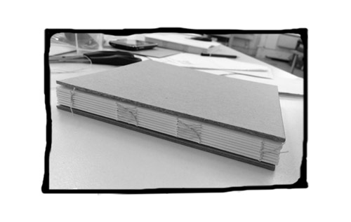
Strange idea for an online era. To bind a book.

Though tangible physical design, as opposite to digital, evokes emotions so different – more real, I would say, and not only for me i bet! Taking into consideration that the workshop of the book binding in London Centre for Book Arts was fully sold out during just a couple of weeks.
And the reason for that, I think, is not only the market’s demand for bespoke, handmade or/and very time consuming products (it took me the whole day to bind one book) VS mass production and very average quality, but also the natural desire for ‘real’ things and for creating these things and if we go dipper in understanding that ‘real things’ then … maybe even the eternal pursuit of reality as well as creating that reality whatever that means.
And also the whole idea to design a book… what can be wiser more intellectual and philosophical in one’s imagination than a book? I mean the whole idea of creating one of these idle objects and creating it properly, according to the old traditions of book binding. How great is that?
And was it that great indeed!
That book binding workshop in London Centre for Book Arts last month was inspiring, fun and just amazing. It was very English (which is after 5 years living in England still fascinating and very dear for me):
– informal, but expensive
– very cold and inconvenient but incredibly friendly …
– very loose but highly professional and qualitatively as a workshop –
very London way, I think, very ‘hackney wick’ even.
Inspired by book binding in London this March.
Yes, I was! I think we all were. There were this lovely creative vibes in the book bonding workshop. Everyone was ready to start binding their second book just after finishing the class… or to start drawing… or even to update their blog!
But not just inspiring! I learned this little adorable things I always noticed but never new about books and paper and spines. Like creating the rounded spine with a hammer! Or why some pages in the book are still folder but not yet separated, you know, so that you have to tear the edge of the page to be able to turn it!
Or minor pencil numbers marks on some pages upside down. Or grain direction of the paper, that creates this slight feeling if comfortably turning a page (if the grain direction is correct) or uncomfortable (if not)… I never knew why some books are so inconvenient to read, to hold, to turn the pages! – well that’s why- because of the grain! How amazing is that.
And now only imagine, knowing all that (plus learning more) can it be applied to designing a book, where you need to tear the pages edges to turn it, or insert the pages with the wrong grain direction where the story becomes tense or uncomfortable… How great would it be, if not only the content and typeface tell you the story but the book itself!?
And I think, I will do it!
Welcome to WordPress. This is your first post. Edit or delete it, then start blogging!
Contemporary Graphic Art Fair in Somerset House, London
It was great and inspiring exhibition. There were some workshops as well. Many artworks were so simple in a good way. It was one of this event after which you want to come back home and carry on working on your current project, or to start a new one, or even a couple of new ones…
They were selling amazing posters, books and CARDS, oh the whole box of cards. Great.
The exhibition is until 1 April. Strongly recommended.