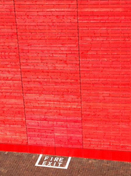
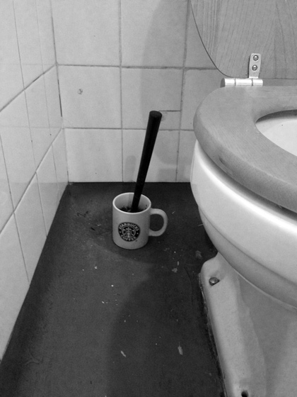
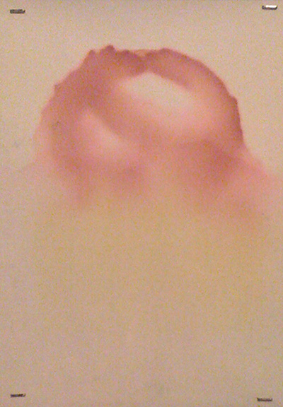
I like how red it is. And how caring the sign is.
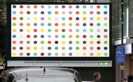
Art Everywhere UK
This summer charitable Tate artcampaign across the UK.
Vote now to decide which British masterpieces will be appearing on billboards across the UK. To get involved and find out more visit Art Everywhere: http://arteverywhere.org.uk/
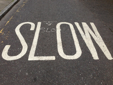
Slow on Bermondsey Wall East in London
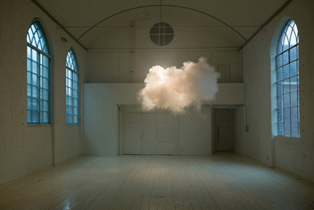
Indoor Cloud by Berndnaut Smilde
More of his cloud installations and other works: www.berndnaut.nl
Impossible Image by Richard Mosse
Why people think that pink image is impossible but black and white is? Black and white images are as unrealistic as these colourful landscapes by Richard Mosse. Plus the reason of this unexpected shade of pink for a green landscape is incredibly dramatic yet very unexpectedly beautiful.
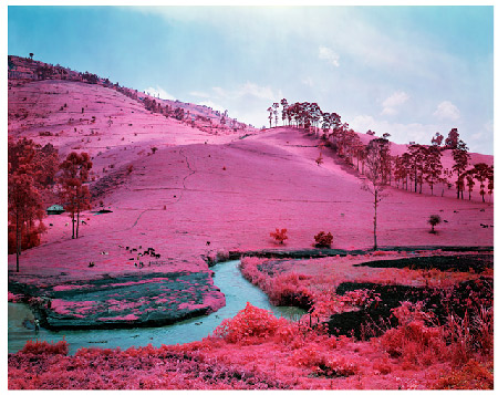
The visuals had been for military purpose. The technology behind that was recognising and highlighting the high concentration of chlorophyl in the plants as opposite to camouflaged areas. Therefore the purpose of the colourful visuals is to find the enemy… vibrant beautiful colour serve the purpose of war and elimination not art neither creation… heartbreaking
Video about the project is here: Richard Mosse Impossible Image
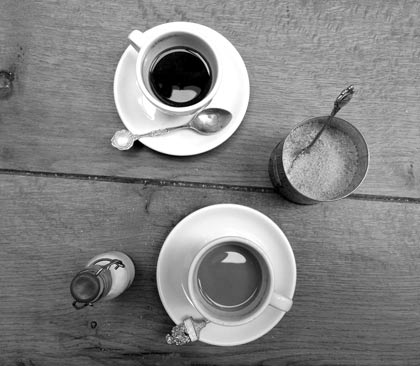
Coffee Shop On Wardour
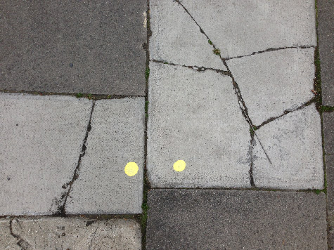
Yellow Dots
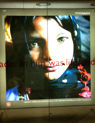
In Him Was Life. Flipped
Prohibitory Sign Being Washed Away by the Rain on Bermondsey Wall East Street
How optimistic! No sign stays for long, neither does prohibition, well not under the rain at least… And if someone creates rules and puts signs, it doesn’t necessarily mean that anyone else will follow them… and the reason why they might not do it is not a disrespect, or disagreement, it’s just because they might not recognise them… under the rain.
But not only that.
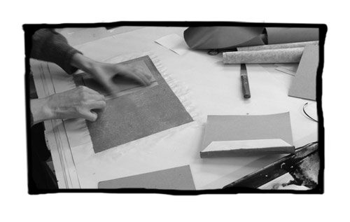
Book Binding in London
Strange idea for an online era. To bind a book.
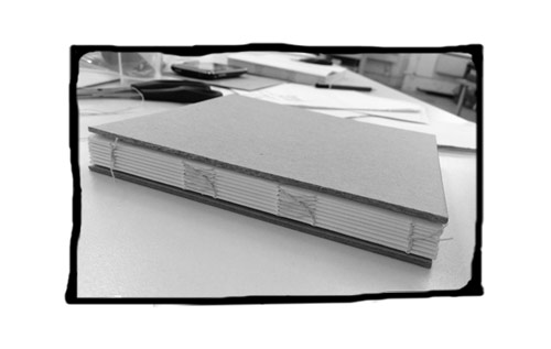
Though tangible physical design, as opposite to digital, evokes emotions so different – more real, I would say, and not only for me i bet! Taking into consideration that the workshop of the book binding in London Centre for Book Arts was fully sold out during just a couple of weeks.
And the reason for that, I think, is not only the market’s demand for bespoke, handmade or/and very time consuming products (it took me the whole day to bind one book) VS mass production and very average quality, but also the natural desire for ‘real’ things and for creating these things and if we go dipper in understanding that ‘real things’ then … maybe even the eternal pursuit of reality as well as creating that reality whatever that means.
And also the whole idea to design a book… what can be wiser more intellectual and philosophical in one’s imagination than a book? I mean the whole idea of creating one of these idle objects and creating it properly, according to the old traditions of book binding. How great is that?
And was it that great indeed!
That book binding workshop in London Centre for Book Arts last month was inspiring, fun and just amazing. It was very English (which is after 5 years living in England still fascinating and very dear for me):
– informal, but expensive
– very cold and inconvenient but incredibly friendly …
– very loose but highly professional and qualitatively as a workshop –
very London way, I think, very ‘hackney wick’ even.
Inspired by book binding in London this March.
Yes, I was! I think we all were. There were this lovely creative vibes in the book bonding workshop. Everyone was ready to start binding their second book just after finishing the class… or to start drawing… or even to update their blog!
But not just inspiring! I learned this little adorable things I always noticed but never new about books and paper and spines. Like creating the rounded spine with a hammer! Or why some pages in the book are still folder but not yet separated, you know, so that you have to tear the edge of the page to be able to turn it!
Or minor pencil numbers marks on some pages upside down. Or grain direction of the paper, that creates this slight feeling if comfortably turning a page (if the grain direction is correct) or uncomfortable (if not)… I never knew why some books are so inconvenient to read, to hold, to turn the pages! – well that’s why- because of the grain! How amazing is that.
And now only imagine, knowing all that (plus learning more) can it be applied to designing a book, where you need to tear the pages edges to turn it, or insert the pages with the wrong grain direction where the story becomes tense or uncomfortable… How great would it be, if not only the content and typeface tell you the story but the book itself!?
And I think, I will do it!


